Text
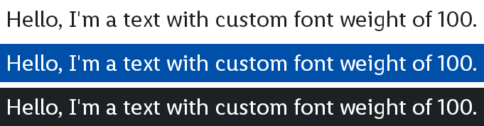
The Text composable can be used to display plain text or styled text from a TypographyDimensions, FontFamily, and FontWeight.
Parameters
The text to be displayed.
The TypographyDimensions style to apply to the text.
The FontFamily to use for the text.
The FontWeight to apply to the text.
The text Color.
An optional maximum number of lines for the text to span, wrapping if necessary. If the text exceeds the given number of lines, it will be truncated.
The TextDecoration to paint on the text (e.g., an underline).
The TextAlign alignment of the text within the lines of the paragraph.
The Text composable can be used to display plain text or styled text from a Typography and FontWeight. The text will be truncated with an ellipsis if it exceeds the given number of lines.
Parameters
The text to be displayed.
The Typography style to apply to the text.
The FontWeight to apply to the text.
The text Color.
An optional maximum number of lines for the text to span, wrapping if necessary. If the text exceeds the given number of lines, it will be truncated.
The TextDecoration to paint on the text (e.g., an underline).
The TextAlign alignment of the text within the lines of the paragraph.
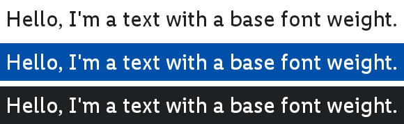
The Text composable can be used to display plain text or styled text from a BaseTypography. The text will be truncated with an ellipsis if it exceeds the given number of lines.
Parameters
The text to be displayed.
The BaseTypography style to apply to the text.
The text Color.
An optional maximum number of lines for the text to span, wrapping if necessary. If the text exceeds the given number of lines, it will be truncated.
The TextDecoration to paint on the text (e.g., an underline).
The TextAlign alignment of the text within the lines of the paragraph.
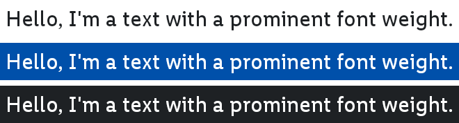
The Text composable can be used to display plain text or styled text from a ProminentTypography. The text will be truncated with an ellipsis if it exceeds the given number of lines.
Parameters
The text to be displayed.
The ProminentTypography style to apply to the text.
The text Color.
An optional maximum number of lines for the text to span, wrapping if necessary. If the text exceeds the given number of lines, it will be truncated.
The TextDecoration to paint on the text (e.g., an underline).
The TextAlign alignment of the text within the lines of the paragraph.
The Text composable can be used to display plain text or styled text from a TypographyDimensions, FontFamily, and FontWeight. The text will be truncated with an ellipsis if it exceeds the given number of lines.
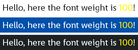
This is a version of Text using AnnotatedString, which enables more granular styling:
val text = buildAnnotatedString {
    append("Hello, here the font weight is ")

    withStyle(
        style = SpanStyle(
            color = OdsTheme.color.text.bg.accent,
        ),
    ) {
        append("100")
    }

    append("!")
}

Text(
    text = text,
    typography = OdsTheme.typographies.mobile.body.normal,
    fontFamily = OdsTheme.typography.fontFamily.primary
    fontWeight = FontWeight(100),
    color = OdsTheme.color.text.bg.primary,
)
Parameters
The AnnotatedString text to be displayed.
The TypographyDimensions style to apply to the text.
The FontFamily to use for the text.
The FontWeight to apply to the text.
The text Color.
An optional maximum number of lines for the text to span, wrapping if necessary. If the text exceeds the given number of lines, it will be truncated.
The TextDecoration to paint on the text (e.g., an underline).
The TextAlign alignment of the text within the lines of the paragraph.
The Text composable can be used to display plain text or styled text from a Typography and FontWeight. The text will be truncated with an ellipsis if it exceeds the given number of lines.
This is a version of Text using AnnotatedString, which enables more granular styling:
val text = buildAnnotatedString {
    append("Hello, here the font weight is ")

    withStyle(
        style = SpanStyle(
            color = OdsTheme.color.text.bg.accent,
        ),
    ) {
        append("100")
    }

    append("!")
}

Text(
    text = text,
    typography = OdsTheme.typographies.mobile.body.normal,
    fontWeight = FontWeight(100),
    color = OdsTheme.color.text.bg.primary,
)
Parameters
The AnnotatedString text to be displayed.
The Typography style to apply to the text.
The FontWeight to apply to the text.
The text Color.
An optional maximum number of lines for the text to span, wrapping if necessary. If the text exceeds the given number of lines, it will be truncated.
The TextDecoration to paint on the text (e.g., an underline).
The TextAlign alignment of the text within the lines of the paragraph.
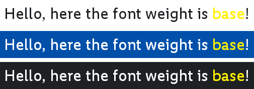
The Text composable can be used to display plain text or styled text from a BaseTypography. The text will be truncated with an ellipsis if it exceeds the given number of lines.
This is a version of Text using AnnotatedString, which enables more granular styling:
val text = buildAnnotatedString {
    append("Hello, here the font weight is ")

    withStyle(
        style = SpanStyle(
            color = OdsTheme.color.text.bg.accent,
        ),
    ) {
        append("base")
    }

    append("!")
}

Text(
    text = text,
    baseTypography = OdsTheme.typographies.mobile.body.normal,
    color = OdsTheme.color.text.bg.primary,
)
Parameters
The AnnotatedString text to be displayed.
The BaseTypography style to apply to the text.
The text Color.
An optional maximum number of lines for the text to span, wrapping if necessary. If the text exceeds the given number of lines, it will be truncated.
The TextDecoration to paint on the text (e.g., an underline).
The TextAlign alignment of the text within the lines of the paragraph.
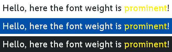
The Text composable can be used to display plain text or styled text from a ProminentTypography. The text will be truncated with an ellipsis if it exceeds the given number of lines.
This is a version of Text using AnnotatedString, which enables more granular styling:
val text = buildAnnotatedString {
    append("Hello, here the font weight is ")

    withStyle(
        style = SpanStyle(
            color = OdsTheme.color.text.bg.accent,
        ),
    ) {
        append("prominent")
    }

    append("!")
}

Text(
    text = text,
    baseTypography = OdsTheme.typographies.mobile.body.normal,
    color = OdsTheme.color.text.bg.primary,
)
Parameters
The AnnotatedString text to be displayed.
The ProminentTypography style to apply to the text.
The text Color.
An optional maximum number of lines for the text to span, wrapping if necessary. If the text exceeds the given number of lines, it will be truncated.
The TextDecoration to paint on the text (e.g., an underline).
The TextAlign alignment of the text within the lines of the paragraph.