IndependentTab
fun IndependentTab(text: String, isSelected: Boolean, onClick: () -> Unit, modifier: Modifier = Modifier, interactionSource: MutableInteractionSource = remember { MutableInteractionSource() })
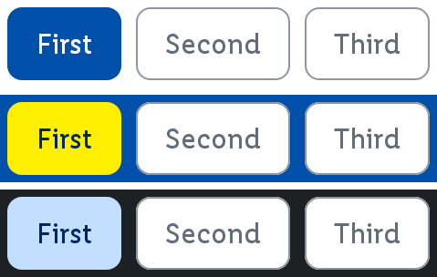
Tabs component provides a way to organize content into separate views that users can switch between by clicking on tab headers. It's commonly used for presenting different sections of content in a compact and organized manner, making it ideal for dashboards and multi-section forms.
For more information visit the ODS Core Documentation
Parameters
text
The text to be displayed inside the tab.
isSelected
Whether this tab is the selected one.
onClick
The callback to be invoked when this tab is clicked.
interactionSource
An optional hoisted MutableInteractionSource for observing and emitting Interactions for the tab. You can use this to change the tab's appearance or preview the tab in different states. Defaults to a remembered MutableInteractionSource.