Switch
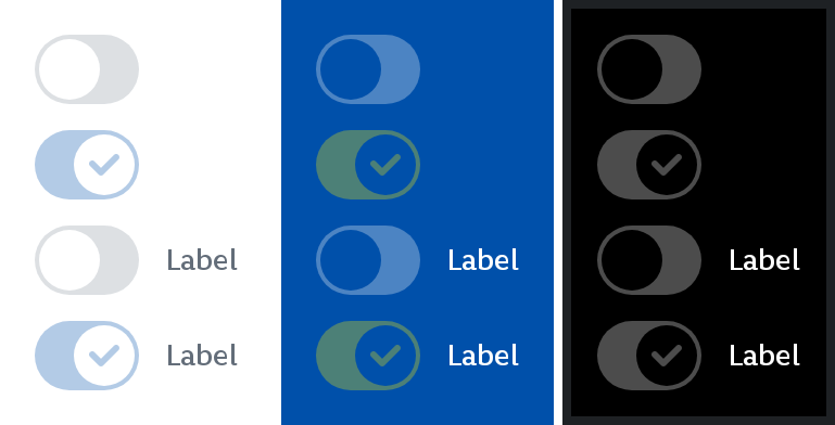
A Switch is a UI element that allows the user to toggle between two states - on and off.
Toggle switches are best used for changing the state of system functionalities and preferences. Toggles may replace two radio buttons or a single checkbox to allow users to choose between two opposing states.
Switches can have an optional label.
Enabled
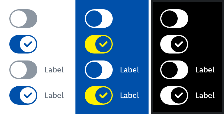
Disabled
Parameters
Whether the switch is currently checked.
Callback invoked when the checked state of the switch changes.
Whether the switch is enabled or not. Defaults to true.
An optional label to be displayed next to the switch.
An optional hoisted MutableInteractionSource for observing and emitting Interactions for the switch. You can use this to change the switch's appearance or preview the switch in different states. Defaults to a remembered MutableInteractionSource.