Checkbox
fun Checkbox(state: ToggleableState, onClick: () -> Unit, modifier: Modifier = Modifier, isEnabled: Boolean = true, hasError: Boolean = false, interactionSource: MutableInteractionSource = remember { MutableInteractionSource() })
A checkbox is a component that allows users to select one or multiple options from a set.
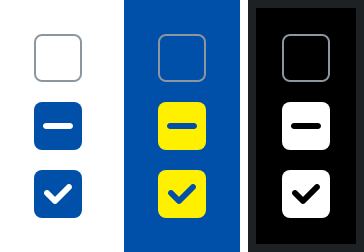
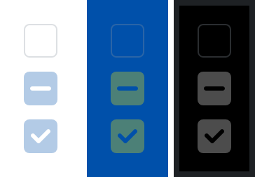
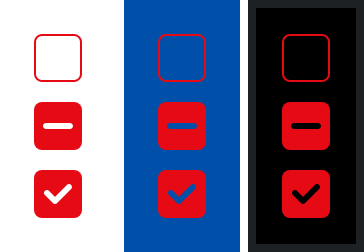
States
The checkbox can be in different states that can be toggled with the isEnabled and hasError parameters.
Disabled
Error
Parameters
state
The ToggleableState of the checkbox.
onClick
The Lambda to be invoked when the checkbox is clicked.
isEnabled
Whether the checkbox is enabled or not. Defaults to true.
hasError
Whether the checkbox is in an error state or not. Defaults to false.
interactionSource
An optional hoisted MutableInteractionSource for observing and emitting Interactions for the checkbox. You can use this to change the checkbox's appearance or preview the checkbox in different states. Defaults to a remembered MutableInteractionSource.