RadioButtonLabel
A radio button is a component that allows users to select one option from a set. Use radio buttons for exclusive selection, if you think that the user needs to see all available options side-by-side.
This version of the RadioButton has a label, and optional images on the left and right side of the label.
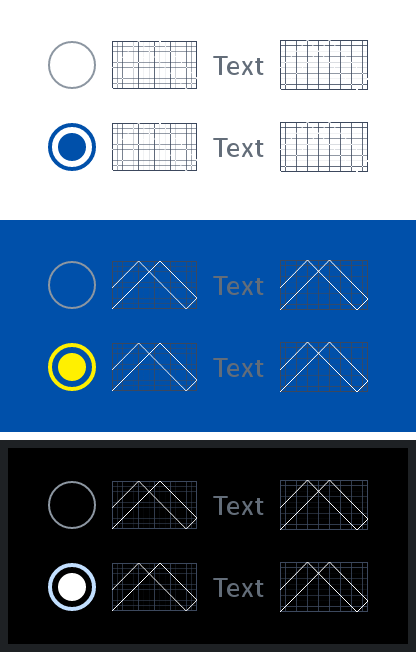
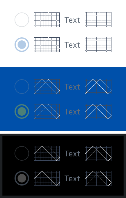
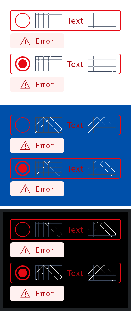
States
The radio button with label can be in different states that can be toggled with the isEnabled and labelState parameters.
Disabled
Error
Parameters
Whether the radio button is selected or not.
The Lambda to be invoked when the radio button is clicked.
An optional Painter to be displayed on the left of the radio button. Defaults to null.
The text to be displayed as the label of the radio button. Defaults to an empty string.
An optional Painter to be displayed on the right of the radio button. Defaults to null.
Whether the radio button is enabled or not. Defaults to true.
The LabelState of the label. Defaults to LabelState.Default.
An optional hoisted MutableInteractionSource for observing and emitting Interactions for the radio button. You can use this to change the radio button's appearance or preview the radio button in different states. Defaults to a remembered MutableInteractionSource.