ClusterCard
fun ClusterCard(title: String, image: Painter, size: ClusterCardSize, onClick: () -> Unit, modifier: Modifier = Modifier, interactionSource: MutableInteractionSource = remember { MutableInteractionSource() })
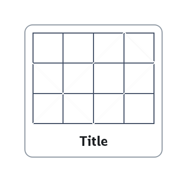
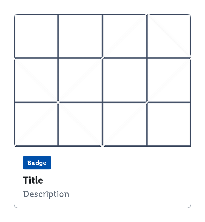
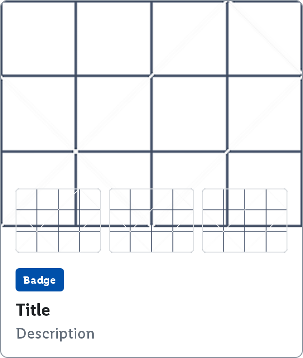
This card creates consistent and efficient category groupings on screens while ensuring a unified look and feel. The cluster card offers two sizes:
Small
Large
Large with related products
Parameters
title
The title to be displayed in the cluster card.
size
The ClusterCardSize to be used for the cluster card.
interactionSource
An optional hoisted MutableInteractionSource for observing and emitting Interactions for the card. You can use this to change the button's appearance or preview the button in different states. Defaults to a remembered MutableInteractionSource.
image
The image to be displayed in the cluster card.