Button
A button should lead the user to a certain action. Unique labels give the user a clear message which action is exactly triggered.
For more information visit the ODS Core Documentation

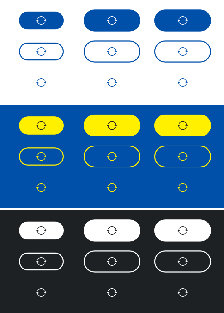
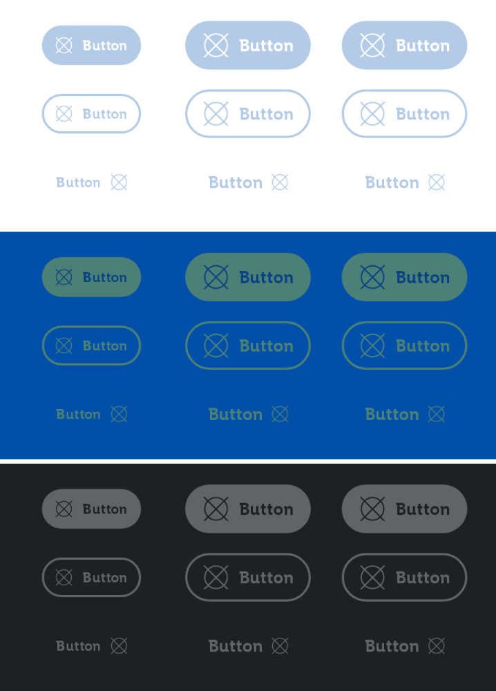
States
The button can be in different states that can be toggled with the isEnabled and isLoading parameters.
Loading
Disabled
Parameters
The text to be displayed in the button.
The Lambda to be invoked when the button is clicked.
An optional ButtonType to be applied to the button. Defaults to ButtonType.Primary.
An optional ButtonSize to be applied to the button. Defaults to ButtonSize.Medium.
An optional icon to be displayed at the start (ButtonType.Primary, ButtonType.Secondary) or the end (ButtonType.Tertiary) of the button.
Whether the button is enabled or not. Defaults to true.
Whether the button is loading or not. Defaults to false.
An optional content description for accessibility. If not provided, text will be used.
An optional hoisted MutableInteractionSource for observing and emitting Interactions for the button. You can use this to change the button's appearance or preview the button in different states. Defaults to a remembered MutableInteractionSource.