StatusIconButton
Informs users of a changed state within an icon through visual cues for improved awareness and scannability. The state of this button often reflects the system state or the user's interaction with them, helping to communicate feedback or guide behavior. It comes in two IconButtonVariants.
Example - a heart icon changes from outlined to filled style on a tap/click to indicate that item is added to wish-list.
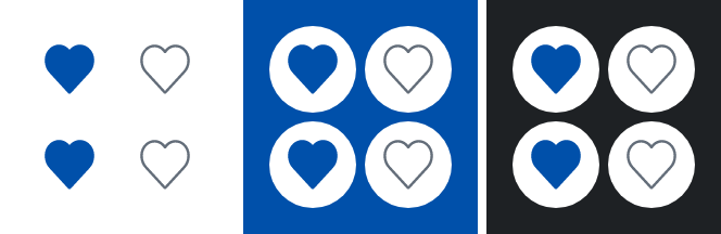
IconButtonVariant.Positive
If need be, the button can be disabled: 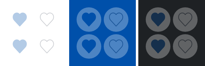
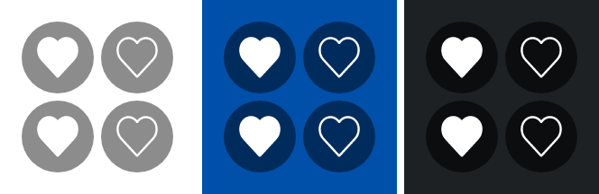
IconButtonVariant.Discrete
If need be, the button can be disabled: 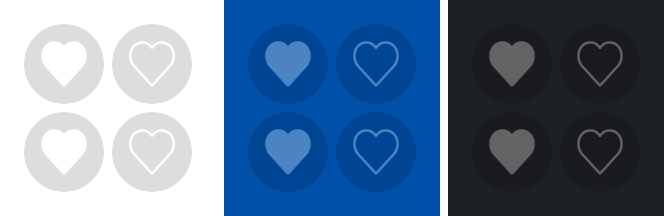
Parameters
Whether the button is currently checked.
The painter for the icon to display when the button is unchecked.
The painter for the icon to display when the button is checked.
Callback invoked when the checked state of the button changes.
The Modifier to be applied to the button.
Whether the button is enabled.
The variant of the button, which determines its appearance.
Text used by accessibility services to describe what this icon button represents. This should always be provided unless this icon button is used for decorative purposes, and does not represent a user action.
The MutableInteractionSource representing the stream of Interactions for this button. You can create and pass in your own remembered instance to observe Interactions and customize the appearance / behavior of this button in different states.