StandardIconButton
Icon buttons fulfill functional needs of UI designs in places where traditional CTA buttons would have too strong visual emphasis. It comes in two IconButtonVariants, and two StandardIconButtonSizes
Note: Avoid using notificationIndicator in the modifier, because then, it will be show over the whole StandardIconButton instead of the Icon.
IconButtonVariant.Positive
If need be, the button can be disabled: 
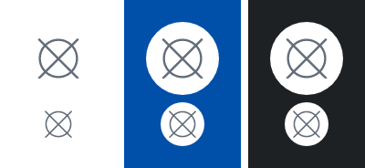
IconButtonVariant.Discrete
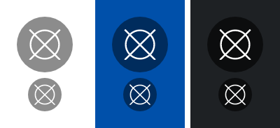
If need be, the button can be disabled: 
Parameters
The Painter for the icon to display.
The action to perform when the button is clicked. Not performed when the button is disabled.
Optional Modifier to be applied to the PrimaryIconButton. Defaults to Modifier.
Whether the button is enabled or not. Defaults to true.
Optional IconButtonVariant of the button. Defaults to IconButtonVariant.Positive.
Optional StandardIconButtonSize of the button. Defaults to StandardIconButtonSize.Medium.
The String describing the icon button for accessibility.
Optional NotificationIndicatorAppearance of the button. Only applicable for StandardIconButtonSize.Medium. Defaults to null.
Optional hoisted MutableInteractionSource for observing and emitting Interactions for this icon button. You can use this to change the button's appearance or preview the button in different states. Defaults to a remembered MutableInteractionSource.