Accordion
It is a space-saving UI element with expandable content that users can open and close by tapping/clicking them. When another item is selected, the previously open content typically collapses, ensuring only one or a few sections are open at a time. It is commonly used for organizing and presenting content in a structured, interactive way, making it ideal for FAQs and other situations where space efficiency is important.
For more information visit the ODS Core Documentation
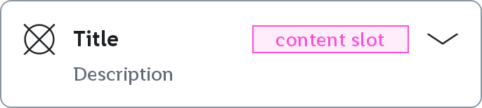
Collapsed
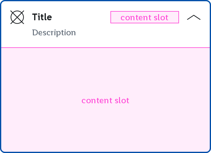
Expanded
Parameters
optional description String to be displayed. Empty by default.
optional AccessibilityPainter to draw an icon inside the Accordion. If null no icon will be displayed. Defaults to null
optional Lambda to be executed when the Accordion's header is clicked. Defaults to null.
optional AccordionState of the the Accordion. Collapsed by default.
optional MutableInteractionSource representing the stream of Interactions for this component. You can create and pass in your own remembered instance to observe Interactions and customize the appearance / behavior of this component in different states. Defaults to remembered MutableInteractionSource.
optional Accordion.Translations provided for the semantics of the icon. If null, no semantics will be set. Defaults to Accordion.Translations.
optional @Composable slot to be used as the Accordion's header content. If null no custom header content will be shown. Defaults to null.